Short answer
- Use heavy card, watercolor paper, or kraft card in the 200 to 300 grams per square meter range, or buy pre-cut blank tags in a similar weight. Cut tags about 2 by 3.5 inches, punch the hole before painting, and leave enough margin that the hole does not tear out. Choose one paint and learn its behavior: watercolor for soft, translucent washes, gouache for opaque, matte coverage that can cover a mistake, or acrylic for a durable finish that is water resistant once dry. Limit the palette to three or four colors, test every color dry on scrap card from the same pack, and paint one simple motif per tag, such as a greenery sprig, a star, or a row of dots. Work in batches, painting all the leaves first, then all the berries, then the details, and let each layer dry before adding the next. Add names only when the paint is fully dry, writing slowly in a fine pen or paint pen, or practicing brush lettering first on scrap. Thread twine or ribbon through the hole, tie tags on only after wrapping, and store spares flat and dry.
Introduction
A hand-painted gift tag is a small thing that changes how a present feels. It tells the recipient that someone sat down, picked up a brush, and made something just for them, and it turns even simply wrapped paper into something that looks considered. Hand-painted tags are also forgiving. Simple shapes, a limited palette, and a steady hand matter far more than artistic training, and a set of tags can be finished in a single relaxed afternoon.
This guide covers the whole process, from choosing paper by weight and paint by how it covers and dries, to painting simple holiday motifs, adding names neatly with printed lettering or brush lettering, and finishing tags so they survive handling, transport, and a few weeks under a tree. The same method works beyond winter holidays. Only the motifs and colors change for birthdays, weddings, baby showers, and thank you gifts.
Why Paint Tags Instead of Buying Them
Store-bought tags are convenient, but they all look alike, and they rarely match your wrapping paper exactly. Painting your own lets you match colors to the paper you already have, use the same motif across every gift for a coordinated look, and add names in your own hand, which is part of the charm. It is also a practical way to use up small amounts of paint and paper left over from other projects.
Once you have painted one batch, the next batch is faster. A stash of painted blanks, with names added later, also solves the last minute gift problem.
Paper First: Weight, Surface, and Why Thin Paper Fails
Paper is the decision that determines whether the rest of the project feels easy or frustrating, so choose it before you choose paint.
Paper weight is given in grams per square meter, shortened to gsm, or in pounds per ream. The two scales describe the same thing, thickness and substance, in different units. A watercolor paper guide from Painters Online, the Leisure Painter and The Artist resource, gives the conversion that anchors the range used here: 300 gsm is equivalent to 140 lb, and 140 lb, or 300 gsm, is the most common watercolor paper weight, thick enough to take modest washes without buckling too much.
For gift tags, the useful range is a little broader than for a full watercolor painting, because a tag takes small, controlled strokes rather than a flooded wash. Heavy card stock, watercolor paper, or kraft card in the 200 to 300 gsm range holds paint without buckling badly and feels substantial in the hand. At the lower end of that range, keep washes small and not too wet. At 300 gsm, you have more freedom to lay a background wash or to repaint a motif. Below that range, problems appear quickly. The same Painters Online guide notes that lighter weight paper will cockle if not pre-stretched. On a tag, cockling means a curled, wavy surface that will not sit flat on a gift, and thin printer paper adds a second failure: it tears at the punched hole when the tag is tied and handled.
Surface matters as well as weight. Watercolor paper comes in three textures. Rough is the most deeply textured. NOT, which means not hot pressed, or cold pressed, has a gentler texture and is the most popular surface. Hot pressed paper is passed through heated rollers to a smooth finish and is suited to fine detail and pen work. For tags, a smooth or NOT surface is the practical choice, because a rough surface breaks up tiny strokes and makes small lettering harder to read. Sizing also matters. Painters Online explains that size is added to prevent a blotting paper surface, and that better papers are sized inside and on the surface for a harder surface. Test the actual card you bought, because two packs both labeled heavy can behave very differently, and a glossy coated card can make water based paint bead.
Buy pre-cut blank tags if you want to save cutting time and get consistent holes and corners. Cut your own if you want unusual shapes, larger tags for large presents, or tags from a specific kraft or colored card that matches your wrapping. Either way, keep a few spare blanks. A spare removes the pressure that makes hands shake.
Paint: Watercolor, Gouache, and Acrylic Behave Differently
Watercolor, gouache, and acrylic all work on tags, but they are not interchangeable. Choosing by coverage and by what happens when the paint dries prevents most disappointments.
Watercolor is transparent, which is why it looks luminous on white card and goes dull or invisible on dark kraft. It is best for soft washes and pale greenery on light card. Its limit is coverage: it will not hide a mistake or a darker layer. Work light to dark, and accept that a correction usually means starting that tag again.
Gouache is opaque watercolor. Tate defines it as paint made from pigments bound in water soluble gum, like watercolor, but with the addition of a white pigment in order to make it opaque, with larger percentages of binder and inert pigments such as chalk added to enhance opacity, forming a thicker layer that does not allow the paper to show through. A Bromleys Art Supplies introduction to gouache, a specialist art supplier, adds the working detail: gouache and watercolor are both made of color particles suspended in gum arabic, but gouache has more pigment, packed more tightly, which creates an opaque, matte finish. That opacity is why gouache shows up on kraft and on dark card, why it can cover a mistake once the first layer is dry, and why you can paint light over dark, a move watercolor cannot offer. The same introduction notes two cautions that matter on tags. Traditional gouache can be reactivated with water after it dries, so a damp hand, a wet wrapping session, or a later wet brush will lift it. Acrylic, by contrast, is unresponsive and durable once it has set. Traditional gouache also is not acrylic gouache: the acrylic version dries waterproof and is a different product, so read the tube rather than assuming.
Acrylic is a plastic polymer paint. Golden Artist Colors describes its gels and mediums, which share the acrylic polymer binder, as 100 percent acrylic polymers with excellent flexibility and chemical, water, and ultraviolet resistance. On a tag that means a durable finish that does not reactivate when damp. Winsor and Newton guidance for its Galeria acrylic range, reproduced by Bromleys, states that thin films dry in 10 to 20 minutes and thicker films can take an hour or more. Golden makes the broader point that drying is influenced most by thickness and by temperature, humidity, and airflow, and that while acrylics surface dry, or skin over, very quickly, sometimes within minutes, they typically take much longer to thoroughly dry. A thick dot that feels dry on top can still be soft underneath, so do not stack tags at the first touch dry moment.
If you are choosing one paint for a first batch, gouache is a friendly middle ground: easy to control, easy to layer, and readable on most card colors. Choose watercolor if you love soft color and will work on white or cream card. Choose acrylic if the tags will travel, be handled by children, or be tied to gifts that may sit in a damp porch or a cold car, and give them extra drying time before stacking.
Brushes and the Rest of the Kit
You need only two or three brushes: a small round brush for details and dots, a medium round brush for leaves and petal shapes, and optionally a flat brush for a background wash. Add a pencil, a fine tip permanent pen or a paint pen for names, a hole punch, and string, twine, or ribbon. Keep a jar of water, a rag or paper towel, a palette, and a scrap sheet cut from the same card as your tags nearby. Testing on scrap first is the single habit that prevents most disappointments, because paint looks different on your tag paper than in the pot, and it changes again as it dries. Protect the table with newspaper or a craft mat, and wash brushes promptly, drying them flat or with tips up, never resting on their bristles.
Preparing and Cutting Your Tags
A standard tag is roughly 2 by 3.5 inches, but there is no rule. A larger tag suits a big present and gives shaky lettering more room. A small tag suits a jar or a bottle.
If you are cutting your own, measure and mark a rectangle, cut it out, and trim one end into a point if you like, by marking the center of one short edge and cutting diagonally from each corner to that point. Punch the hole before painting, so a slip does not ruin finished artwork, and leave enough margin that the hole does not tear through under twine. Lightly sketch in pencil if it helps, keeping lines faint. Then paint in batches: all the leaves first, then all the berries, then the details. Batch painting is faster, gives a more consistent set, and builds in drying time.
Choosing a Palette That Looks Deliberate
A limited palette looks more polished than every color you own. For winter holidays, three or four colors are plenty: a deep green, a warm red or berry tone, a gold or ochre, and a neutral such as cream, brown, or charcoal for outlines and lettering. For a birthday or spring occasion, the same idea applies: pick a main color, a supporting color, and a metallic or neutral accent.
Test your palette on scrap card before committing, and judge it dry, not wet. Paint a small swatch of each color, let it dry completely, and check it next to your wrapping paper. Paint shifts as it dries, so the dry swatch is the honest version. If a color looks too bright, mix in a touch of its complement or a little brown to quiet it down. Mix enough of a custom color for the whole batch before you start, because remixing the exact shade halfway through is difficult.
Simple Motifs Anyone Can Paint
You do not need to paint a detailed scene. A few simple motifs, repeated cleanly, make beautiful tags.
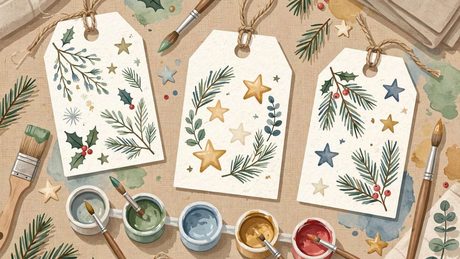
A sprig of greenery is the easiest winter motif. Load a medium round brush with green paint, press it down to make a leaf shape, and lift to a point. Repeat along an imaginary stem, alternating sides and getting slightly smaller toward the tip. Add a few tiny dots in red or gold for berries. The charm is in the repetition and the slight variation between leaves, not in botanical accuracy.
A simple star is equally forgiving. Paint five short strokes radiating from a center, or paint a star shape in gold and outline it thinly once dry. A row of small dots, a painted stripe, a simple tree made from three stacked triangles, a wreath made from a circle of short leaf strokes, and a bauble made from a filled circle with a tiny rectangle cap all read instantly as holiday decoration without requiring drawing skill.
For non-winter holidays, adapt the same approach: a single flower made from five petal strokes, a small heart, or a balloon shape. One strong motif per tag looks better than several competing ones. Leave breathing room around the motif and the name. If a tag feels empty, add a border of tiny dots rather than a second motif.
Painting Tips for a Clean Result
Paint consistency matters more than brush skill. Paint that is too watery will bleed, pool in the low spots of a buckled tag, and wrinkle the paper. Paint that is too thick will drag, leave ridges, and, in gouache, crack if it is laid on in a heavy layer. Aim for the consistency of single cream: fluid enough to flow off the brush, thick enough to hold a shape. Load the brush, then test a stroke on scrap before touching the tag, every time you reload.
Let layers dry before adding detail on top. Painting a red berry over a still wet green leaf will smear the two colors together into mud in watercolor and gouache, and in acrylic it will drag the skin that has already formed. Watercolor and gouache on small motifs dry in minutes in a dry room, so a short pause between stages is usually enough, but humidity stretches that pause. The batch method is the easiest timer: work through all the tags at one stage before returning to the first tag for the next stage.
Embrace small imperfections. A slightly uneven leaf or a dot that is a touch larger than its neighbors reads as handmade, which is the point. If a motif goes badly wrong in gouache or acrylic, you can often paint over it once dry with an opaque color or turn it into a different shape, such as covering a spoiled leaf with a filled bauble circle. In watercolor, covering rarely works, so set that tag aside for the practice pile and use a spare. Keep a practice pile rather than a bin: practice tags are perfect for testing lettering and sealant later.
Turn the tag as you paint rather than reaching across it, so your sleeve does not drag through wet paint.
Adding Names: Printed Lettering, a Nameplate, and Brush Lettering
Names are usually the part people worry about most, but they are simpler than they seem once you separate the three choices: neat printed lettering, a painted nameplate, or brush lettering.
Wait until the paint is completely dry before writing anything. Then practice the exact name on scrap first, especially if it is long or unfamiliar, and write slowly. A slightly slower, deliberate letter looks better than a rushed one, and a simple printed style in capital or lower case letters is easier to read, and easier to keep even, than fancy script on a small tag. Place the name where it has room: below the motif, on the back of the tag, or in a clear space to one side. Writing on the back is a good option if the front design fills the tag, and it keeps the artwork uncluttered. Keep messages short: a name and perhaps a one line greeting. A tag is not a card, and a short message reads more elegantly than a paragraph squeezed into a small space.
If your handwriting feels shaky, write the name in pencil first, go over it in pen, and erase the pencil once the ink is fully dry. Use a light hand for the pencil so the eraser does not lift gouache or scuff acrylic. Another option is to paint a small plain rectangle or oval on the tag as a nameplate, let it dry, and write inside it. The defined space makes lettering feel intentional, gives a watercolor tag a pale, smooth writing surface, and hides a wobbly line better than open card does.
Brush lettering is the decorative option, and it works by pressure. Scribblers, a calligraphy supplier, teaches brush pen lettering as letters built from a few basic strokes, with heavy pressure on the downward stroke and light pressure on every upward stroke. Amy Latta, a hand lettering teacher, adds the angle detail: hold the brush pen at about a 45 degree angle with firm pressure for a thick downstroke, then lift it closer to upright, using only the tip with lighter pressure for a thin upstroke. Practice the strokes, not whole names, first, then simple capitals such as T, a vertical downstroke with a thin horizontal stroke, and A, a diagonal upstroke, a diagonal downstroke, and a cross bar. Only then write a name. On a tag, use brush lettering for a short first name only, and use a fine pen for a long name. Do not practice brush lettering for the first time on a finished tag.
A fine tip permanent pen suits most tags. A paint pen gives a more opaque line on dark card, but test it on scrap first, because some paint pens release a sudden blob on the first press.
Finishing, Sealing, and Attaching Tags
Once paint and ink are dry, you can leave tags as they are, or, for watercolor and traditional gouache, add a protective finish, because both can smudge or reactivate with moisture. A light coat of clear matte spray sealant, applied outdoors or in a well ventilated area exactly according to the product label, helps prevent smudging. Acrylic usually needs no sealant. Test any sealant on a practice tag first, since some sprays can darken colors or add unwanted gloss. If the test fails, skip sealing.
Thread twine or ribbon through the hole and tie a loose loop. Do not tie tags onto gifts until the gifts are wrapped, or tags may get bent in handling. If mailing gifts, tuck the tag inside the box or attach it flat against the wrapping, so it does not snag in transit. Store leftover tags flat in an envelope or small box, separated by plain paper if stacked face to face. Kept dry and flat, painted tags last well.
Safety and Practical Notes
Read the labels on your paints and sealants, especially if children will be helping. Some artist paints contain pigments that are not intended for young children, artist ranges and student ranges differ, and spray sealants should be used only by adults in ventilated areas, away from flames and ignition sources, following the label. Keep small items, such as hole punched paper circles, cords, and ribbon offcuts, away from very young children. If you are painting tags for food gifts, keep the tags on the outside of the packaging, never in contact with food, and do not place a sealed or painted tag inside a food container.
Hand-painted gift tags reward a relaxed approach. Choose sturdy paper, limit your palette, repeat one simple motif, respect the drying behavior of the paint you chose, and let the handmade quality speak for itself. The first tag may feel tentative, the fifth will feel confident, and by the end of the batch you will have a set of tags no store could match.
Frequently Asked Questions
Which paper weight is best for hand-painted gift tags?
Heavy card, watercolor paper, or kraft card in the 200 to 300 grams per square meter range is a practical choice. It holds small painted motifs without buckling badly and is strong enough at the punched hole. Watercolor paper at 300 grams per square meter, equivalent to 140 lb, is the most common watercolor weight and takes modest washes well. Lighter paper cockles unless it is pre-stretched, and thin printer paper also tears at the hole, so it is not a good substitute.
Which paint is best for a first batch of tags?
Gouache is the easiest first choice for most beginners. It is opaque, so it shows up on white, kraft, and dark card, and it can cover a mistake once dry. Watercolor is better if you want soft, translucent color on white or cream card and are happy to work light to dark without covering mistakes. Acrylic is better if durability matters most, because it is water resistant once dry, but it dries quickly and thick areas need longer than they first appear to need before stacking.
How long should I let painted tags dry before writing names or stacking them?
Let small watercolor and gouache motifs dry for several minutes until they look matte and feel dry, then wait a little longer before lettering, because ink on a damp surface feathers. For acrylic, manufacturer guidance for one major range gives 10 to 20 minutes for thin films and an hour or more for thicker films to dry, and a surface can skin over in minutes while remaining soft underneath, so give thick dots and heavy strokes at least an hour, and longer in humid or cold conditions, before stacking, sealing, or tying. When in doubt, letter and stack the next day.
Can I fix a mistake on a painted gift tag?
In gouache and acrylic, often yes, once the layer is completely dry. Paint over the mistake with an opaque color, or turn it into a larger shape, such as a bauble, a leaf cluster, or a nameplate. In traditional gouache, remember that a wet brush reactivates the paint beneath, so use as little water as possible for the correction. In watercolor, covering rarely works cleanly, because the paint is transparent. Start that tag again on a spare blank and keep the spoiled tag for practice.
How do I write names neatly if my handwriting is shaky?
Use simple printed lettering, write slowly, and practice the exact name on scrap card first. Lightly pencil the name, write over it in a fine pen, and erase the pencil only after the ink is fully dry. Or paint a plain rectangle or oval nameplate, let it dry, and write inside that defined space. For brush lettering, learn the pressure rule first, heavy on downstrokes and light on upstrokes, and practice the basic strokes on scrap before you letter a finished tag.
Can children help paint gift tags?
Yes, with supervision matched to the child and the materials. Children can paint simple motifs such as dots, stars, and leaves, and can practice names on scrap. Adults should do any spray sealing, in a ventilated area following the label, and should check paint labels first, because some artist pigments are not intended for young children. Keep punched paper circles, cords, and small offcuts away from very young children, and keep finished tags outside any food packaging.
Sources & references
- Tate, Gouache. Used for the definition of gouache as pigments bound in water soluble gum, like watercolor, but with the addition of a white pigment to make it opaque, larger percentages of binder than watercolor, inert pigments such as chalk added to enhance opacity, gouache forming a thicker layer on the paper surface that does not allow the paper to show through, and its use for highlights in watercolor.
- Bromleys Art Supplies, An Introduction to Gouache Paint. Used for gouache and watercolor both being color particles suspended in gum arabic, gouache having more pigment packed more tightly to create an opaque, matte finish, gouache colors being richer and more vibrant, the same brushes serving both paints, traditional gouache being reactivatable with water while acrylic is unresponsive and durable once set, acrylic gouache being a different, waterproof product, and mistakes in gouache being wipeable when wet and reactivatable and blendable when dry.
- Bromleys Art Supplies, Galeria, reproducing Winsor and Newton Galeria Acrylic guidance. Used for Galeria acrylic being usable on paper among other grease free, properly prepared surfaces, thinly and thickly, with a smooth satin finish and strong brush stroke retention, and for the drying times that thin films of color dry in 10 to 20 minutes, thicker films can take an hour or more, completed mural work being touch dry in about 20 minutes, and 48 hours being allowed before varnishing a completed mural work.
- Golden Artist Colors, Gels and Mediums. Used for acrylic gels and mediums being composed of 100 percent acrylic polymers with excellent flexibility and chemical, water, and ultraviolet resistance, and for drying times being influenced most by thickness of application and by temperature, humidity, and airflow, acrylics surface drying or skinning over very quickly, sometimes within minutes, while typically taking much longer to thoroughly dry, with thicker films drying more slowly.
- Painters Online, Watercolour Paper Explained. Used for watercolor paper thickness being expressed in lb per ream and in gsm, 300 gsm being equivalent to 140 lb, 140 lb or 300 gsm being the most common weight and thick enough to take modest washes without buckling too much, lighter weight paper cockling if not pre-stretched, 300 lb or about 600 gsm being more like card with little distortion, the three textures rough, NOT or cold pressed as the most popular gentler texture, and hot pressed as a smooth finish suited to fine detail and pen work, and sizing preventing a blotting paper surface, with better papers sized internally and on the surface for a harder surface.
- Scribblers, Learn Brush Pen Lettering. Used for brush pen lettering letters being built from a few basic brush strokes, the five basic strokes, heavy pressure being applied on the downward stroke and light pressure on every upward stroke, and drill practice for applying and releasing pressure to transition smoothly between thick and thin lines.
- Amy Latta Creations, Beginner Brush Lettering: Basic Brushstrokes. Used for brush lettering being characterized by thick lines on downstrokes and thin lines on upstrokes, holding a brush pen at about a 45 degree angle with firm pressure for downstrokes, holding it higher, closer to upright, with lighter pressure and only the tip for upstrokes and horizontal lines, practicing strokes and then basic capital letters before words, a capital T combining a vertical downstroke and a thin horizontal stroke, and a capital A combining a diagonal upstroke, a diagonal downstroke, and a horizontal cross bar.


