Short answer
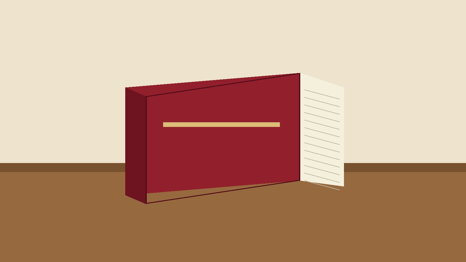
- To draw a book, start with a simple angled rectangle for the cover, add a second set of lines to show the thickness of the pages, then add the spine, the cover overhang, page lines, and shading. That short sequence is the whole method in miniature: shape first, thickness second, detail third, shading last. Most beginners go wrong by adding detail before the shape is right, which is why their book ends up looking like a flat box or a brick. If you get the angled rectangle and the page thickness right, the rest of the drawing almost takes care of itself. This guide walks through a closed book, an open book, and a stack of books, then covers perspective, proportions, shading, and the common mistakes that make a book drawing look flat.
A Note on the Phrase “Draw of a Book”
The phrase “draw of a book” is ambiguous on its own. It could be read as a request for a drawing of a book, a picture of a book, or a description of a book drawing. A literal phrase search of “draw of a book” shows that the dominant reader intent is a how to draw tutorial: the top results are step by step guides to drawing a closed book, an open book, and a stack of books. This article therefore answers the tutorial intent, which is what searchers plainly want. If you arrived here wanting a finished picture of a book rather than a lesson, the step by step sections below will still get you there, because by the final step you will have drawn one yourself.
What You Need
You need very little to draw a book well. A standard pencil, a sheet of plain paper, and an eraser are enough for the whole lesson, which is the same basic kit recommended by the beginner tutorials checked for this article. A ruler helps for the first few attempts, because straight lines make the perspective easier to judge, but freehand lines are fine once you are comfortable. If you want to go further, add a softer pencil, such as a 4B or 6B, for dark shading, and a pen for inking the finished lines. Colored pencils, markers, or paint are optional and come last, after the structure and shading are finished. One more item matters more than any supply: a real book. Put one on the table beside you and look at it while you draw. Every professional tutorial recommends working from a real book, because your eyes will catch details, such as the cover overhang and the curve of the spine, that memory tends to flatten out.
Know the Parts of a Book Before You Draw One
A convincing book drawing starts with knowing what you are looking at. A book has a front cover, a back cover, and a spine, which is the edge where the pages are bound together. Between the covers sits the page block, the stack of pages themselves. On a hardcover book, the covers extend slightly past the page block. That small overhang is called the square of the book, and it is one of the most important details in a realistic drawing, because the lip of the cover casts a thin shadow onto the pages. A paperback usually has a flatter spine and less overhang, so it looks simpler and more rectangular.
Perspective and Proportion: Why Books Look Like Boxes
A book is a rectangular box, and drawing a box convincingly means drawing it in perspective. Perspective is simply the rule that things farther from your eye look smaller, and that parallel edges appear to meet at a vanishing point on the horizon. For a closed book seen from an angle, the most useful approach is two point perspective: the top and bottom edges of the book angle toward two different vanishing points, one to the left and one to the right. You do not need to mark the vanishing points on the page, but you do need to follow the rule they imply: edges that recede into the distance get shorter and closer together. That is why the far edge of a book in a drawing is shorter than the near edge, even though the real edges are the same length. Beginners often draw both edges the same length, which flattens the book and makes it look like it is facing the viewer straight on.
Proportion matters just as much. A typical novel is taller than it is wide, roughly in the ratio of a rectangle that is about one and a half times as tall as it is wide, while a large art book or a children’s picture book may be closer to square. Check the book on your table: compare its height to its width with your pencil held at arm’s length, and carry that ratio into your drawing. The thickness of the page block should also stay in proportion. A thin paperback has a narrow page block, while a thick reference book has a wide one. If the page block is too thick for the size of the cover, the book looks swollen. If it is too thin, the book looks like a pamphlet. A useful check is to compare the thickness of the page block to the height of the spine: for an ordinary novel, the page block is much narrower than the spine is long, and keeping that relationship will keep the drawing believable.
One more perspective trap deserves attention. When a book lies on a table in front of you, the edge farther from you looks shorter than the edge closer to you, because of foreshortening. Draw what you see, not what you know. Your brain knows the book is a rectangle, but your eyes see a trapezoid, with the far edge shorter. Trust the trapezoid, and the drawing will sit convincingly on the table instead of appearing to tilt toward the viewer.
Method 1: How to Draw a Closed Book, Step by Step
This is the simplest book to draw, and the one to master first. Work lightly in pencil so you can erase the construction lines later.
Step 1: Draw the front cover. Start with a rectangle tilted at a slight angle, so that one long edge is closer to you than the other. This tilted rectangle is the front cover. Keep the corners slightly rounded if you are drawing a softcover, or sharper for a hardcover.
Step 2: Add the thickness. From the right side and the bottom edge of the cover, draw a second set of lines parallel to the first, offset by a short distance. This offset is the page block. The distance you choose here sets how thick the book looks, so keep it modest for a normal novel.
Step 3: Draw the spine. On the left side of the cover, draw a line parallel to the left edge, close to it, to mark the spine. On a hardcover, add a slight outward curve to this line, because a real hardcover spine bulges gently rather than lying perfectly flat. Just beside the spine, add a thin groove line, the small indentation where the cover bends at the hinge. That groove is a tiny detail, but it tells the viewer at once that the book can open.
Step 4: Add the cover overhang. Draw the outer cover lines just a fraction wider than the page block lines. The cover should extend slightly past the pages on the top, bottom, and fore edge, which is the edge opposite the spine. This lip is the square of the book, and it is the detail that separates a realistic book from a plain box.
Step 5: Draw the pages. Inside the page block, add a series of lines parallel to the cover edges to suggest individual pages. Do not try to draw every page. A few crisp lines near the corners, fading lighter toward the middle, will read as a stack of paper far better than dozens of evenly spaced lines, which tend to look striped and busy. This technique is sometimes called suggestive rendering: you suggest the texture rather than recording every sheet.
Step 6: Add the back cover. Close the shape at the bottom with a narrow strip that runs parallel to the page block, showing the back cover peeking out beneath the pages. On many angles this strip is thin, but it completes the three dimensional form and stops the drawing from looking hollow.
Step 7: Add cover details. Draw a title block on the front cover: a rectangle or a pair of parallel lines where a title would sit, plus a small shape for a cover illustration if you like. Keep lettering simple. A short invented title in clear block letters looks better than tiny realistic text, which usually turns messy at drawing scale. If you want text on the pages, use wavy suggestion lines rather than real words, and make those lines follow the direction of the page edges.
Step 8: Clean up. Erase the construction lines that are no longer needed, especially any lines that cross through the page block or the cover. Then go over the final outline with slightly firmer pressure, so the silhouette of the book reads clearly against the paper.
Step 9: Shade. Decide where your light comes from, and keep it consistent. Shade the page block lightly, with the darkest tone in the corners and in the shadow beneath the cover lip. Shade one side of the spine darker than the other if the light falls from one side. Leave a bright strip on the cover where the light hits it directly. This contrast between light and shadow is what turns a flat outline into a solid object.
Step 10: Finish. If you are inking, trace the pencil lines with a pen, let the ink dry fully, and then erase the remaining pencil marks. If you are coloring, fill the cover with an even tone first, then add the shading on top, keeping the page block a pale warm gray or cream so it still reads as paper.
Method 2: How to Draw an Open Book, Step by Step
An open book is harder, because it adds curves to the geometry. Take it slowly, and keep checking against a real open book.
Step 1: Draw the overall shape. Sketch a wide rectangle tilted slightly, as you did for the closed book, but wider than it is tall, because an open book spreads across the table.
Step 2: Mark the gutter. Draw a vertical line down the middle of the rectangle. This is the gutter, the center valley where the pages meet. It is the anchor of the whole drawing, so place it carefully.
Step 3: Curve the pages. From the top of the gutter line, draw a shallow curve outward to the left and another to the right, like the top of a very flat letter U. Repeat at the bottom. These curves are the top and bottom edges of the open pages. The key point is that the pages rise from the gutter and fall toward the outer edges. They do not lie flat, and drawing them flat is the most common reason open book drawings fail.
Step 4: Connect the outer edges. Join the ends of the top and bottom curves on each side with a slightly curved vertical line. You now have two curved page shapes, one on each side of the gutter, like a pair of wings.
Step 5: Add the page layers. Inside each page shape, draw a few curved lines parallel to the top and bottom edges, to suggest the layers of pages beneath the top sheet. Remember that the pages near the middle of the book are more curved than the pages near the cover, because the stack flattens as it reaches the table. Let your lines flatten gradually from the gutter outward, and the stack will look right.
Step 6: Add the cover underneath. Draw the cover as a slightly larger shape beneath and around the pages, following the same curves. The cover should peek out around the page block, especially at the outer corners, and it should lie flat on the table at the edges while the pages arch above it.
Step 7: Add the spine detail. At the bottom center, where the two page shapes meet, draw a small curve to form the spine. Deepen the shadow in the gutter, because the pages block the light there, and that dark valley is what gives the open book its hollow, three dimensional feel.
Step 8: Add text suggestion and shading. Add wavy lines on each page to suggest lines of text, and make sure those lines follow the curve of the page. Straight text lines on a curved page destroy the illusion at once. Then shade: keep the outer edges of the pages light, darken the gutter, and add a soft shadow under the cover where it meets the table.
Method 3: How to Draw a Stack of Books and Books on a Shelf
Once you can draw one book, a stack is a small step further. Draw the bottom book first, using the closed book method, then draw the next book on top of it at a slightly different angle. Vary the sizes: a stack looks natural when the books are not identical, so make one wider, one shorter, and one thicker. Let each book overlap the one below it slightly, and keep the page blocks aligned so the stack does not look like it will topple. For a row of books standing on a shelf, draw a series of narrow vertical rectangles of different heights, sharing edges where books lean against each other. Add a small curved line at the top of each spine for the rounded top edge, and a few horizontal lines for title bands. A leaning book, tilted against its neighbors at an angle, adds life to a shelf drawing, but keep the tilt modest, or the book will look like it is falling.
Shading a Book Drawing: Light, Value, and Cast Shadow
Shading is what separates a diagram from a drawing. Start by choosing a single light direction and writing it down if it helps, for example, light from the upper left. Every shadow in the drawing must agree with that choice. The surfaces facing the light stay pale, the surfaces turned away go darker, and the darkest area of all is usually the cast shadow, the shadow the book throws onto the table. If the light comes from the upper left, the cast shadow falls to the lower right of the book. Drawing that shadow grounds the book: without it, the book appears to float, which is one of the most common beginner errors. A simple horizontal line behind the book, suggesting the back edge of a table, also helps to ground it.
Build shading in layers. Start with a light, even tone over the shadow areas, then add darker layers only where the shadow is deepest: under the cover lip, inside the gutter of an open book, and in the corners of the page block. Leave the brightest highlight untouched, because white paper is the brightest value you have, and once you shade over it you cannot easily get it back. For a matte cover, such as cloth, use soft, even shading with little contrast. For a glossy dust jacket, leave a sharp, bright highlight and a crisp edge to the shadow, because glossy surfaces reflect light in a concentrated way. Cross hatching, which means layering sets of parallel lines in different directions, works well for a rough cloth texture, while smooth shading with the side of the pencil suits a glossy cover.
Pages, Texture, and the Details That Sell Realism
The texture of the pages deserves its own attention, because it is where many drawings go wrong. As noted above, do not draw every page. Draw a few crisp lines near the corners of the page block, let the pencil go lighter in the middle, and add a few short, broken marks to break up the regularity. If the book is old, let the page lines wave slightly instead of running straight, and let one or two pages stick out a little further than the rest. Those small irregularities make the book look used and real. For a leather bound book, soften the corners, because leather wears down with handling, and lift small patches of graphite with an eraser to suggest scuffs. Add tiny cracks near the spine where the material has flexed. For a paperback, keep the edges sharper and the spine flatter, and add a crease line or two across the spine if the book looks well read.
Small props add a lot for little effort. A ribbon bookmark, drawn as two thin parallel lines emerging from the page block and ending in a small V shape, instantly says that this is a book someone reads. A pair of reading glasses resting on an open book, or a pencil lying beside a closed one, gives the drawing a story. Keep props simple and few: one prop supports the book, while three or four compete with it.
Common Mistakes and How to Fix Them
The flat brick: the book looks like a plain box. Fix it by adding the page thickness, the cover overhang, and the spine groove. Those three details are what make a box read as a book.
The floating book: the book has no shadow and no surface line. Fix it by drawing a cast shadow on the correct side for your light direction, and a simple line for the table edge.
The impossible angle: the near and far edges are the same length, so the book looks twisted. Fix it by shortening the far edge and letting the receding edges angle toward each other.
The striped pages: dozens of identical page lines make the page block look like a barcode. Fix it by using fewer lines, darker at the corners and lighter in the middle.
The flat open book: two rectangles side by side with no curve. Fix it by curving the pages up from the gutter and down toward the outer edges, and by darkening the gutter shadow.
The messy text: tiny real words that turn into scribble. Fix it by using wavy suggestion lines that follow the curve of the page, and by keeping any real lettering large and simple, limited to a short title on the cover.
The overworked outline: every construction line left visible, so the drawing looks like a sketch of scaffolding. Fix it by erasing guidelines before shading, and by firming up only the final outline.
Practice Drills That Build Skill Fast
Short, repeated practice beats one long session. Try the 30 second block drill: set a timer and draw a simple book shape in perspective, ten times, from different angles. The point is not a finished drawing but speed and confidence with the basic box. Next, try the lip drill: draw three spine types, flat, rounded, and cracked, and concentrate on the cover overhang in each one. Then try a gutter study: open a real book to the middle, look at how the pages disappear into the center, and draw only that middle section, focusing on how the shadow deepens toward the binding. Ten minutes of these drills, a few times a week, will improve your book drawings faster than copying a finished tutorial once.
Drawing Books With Children
Book drawing is a popular first subject for children, because the shapes are simple and the result is recognizable. For a young beginner, simplify ruthlessly: one tilted rectangle for the cover, one offset line for the thickness, a few page lines, and a title on the cover. Coloring comes right after the outline, and that is fine at this stage, because the goal is confidence, not realism. The simple six step version of the closed book, which takes about 20 minutes at a relaxed pace, is a good first lesson, and it leaves the child with a finished picture to be proud of.
Frequently Asked Questions
How do you draw a book easily for beginners?
Start with a tilted rectangle for the front cover, add a short offset line for the page thickness, then add the spine, a few page lines, and a title on the cover. That is the whole easy method. Keep your pencil lines light so you can erase mistakes, and work from a real book if you can. Once that simple version looks right, add the cover overhang and shading to make it look three dimensional.
How do you draw an open book?
Draw a wide, slightly tilted rectangle, divide it in half with a vertical gutter line, and curve the top and bottom edges of each half so the pages rise from the gutter and fall toward the outer edges. Add curved layer lines inside each half, draw the cover peeking out beneath the pages, and darken the gutter shadow. The curve is the essential part: flat rectangles on either side of a line will not read as an open book.
How do you draw a book cover?
Draw the book first, then treat the front cover as a flat surface for design. Add a title block, a simple illustration shape, and the author’s name in clear block letters. Keep the design bold and simple, because fine detail gets lost at drawing scale. If you are drawing a specific real book, simplify its cover design rather than copying it exactly.
What pencil should I use to draw a book?
A standard HB pencil is fine for the outline and construction lines. For shading, a softer pencil such as a 2B or 4B gives darker tones without pressing hard, which keeps the paper smooth. If you plan to ink the drawing, any fine liner pen works, provided you let the ink dry before erasing the pencil underneath.
Why does my book drawing look flat?
The usual causes are missing page thickness, equal length near and far edges, no cover overhang, and no shading or cast shadow. Check those four things in order. In most cases, adding the thickness and a cast shadow on the correct side for your light direction will fix the flatness at once.
How do you shade a book drawing?
Pick one light direction and keep it consistent. Shade the surfaces turned away from the light, leave the lit surfaces pale, and make the cast shadow on the table the darkest area. Build up tone in light layers, darkest under the cover lip and inside the gutter of an open book. Leave the brightest highlight as untouched white paper.
How long does it take to draw a book?
The simple closed book version takes about 20 minutes at a relaxed pace, including coloring. A shaded, realistic version with an open book or a stack takes longer, often 45 minutes to an hour, because shading and detail take time. Speed comes with practice, and the 30 second block drill in this guide is the fastest way to build it.
Can I draw a book without a ruler?
Yes. A ruler helps while you are learning to judge straight lines and angles, but freehand lines are fine and often look more natural. If your lines wobble, slow down and draw from the shoulder rather than the fingers, using longer, smoother strokes. Slightly imperfect lines suit a hand drawn book, especially an old or well used one.
Sources & references
- My Modern Met, "Learn How to Draw a Book Step by Step" (Margherita Cole), https://mymodernmet.com/how-to-draw-a-book/ . Six step closed book method starting from an angled rectangle, curved spine lines, and inking, plus a stack of books method.
- Easy Drawing Guides, "How to Draw a Book" (really easy drawing tutorial), https://easydrawingguides.com/how-to-draw-a-book-really-easy-drawing-tutorial/ . Ten step closed book method starting from a diagonal spine line and a rhombus cover shape, with page texture and back cover steps.
- How to Draw for Kids, "How to Draw a Book" (Aram Chomoyan), https://howtodrawforkids.com/how-to-draw-a-book/ . Closed book method in six steps using parallel side lines, plus an open book method using a tilted rectangle divided by a gutter line, with a stated time of 20 minutes for the closed book lesson.
- Diffsense, "How to Draw a Book Without Making it Look Like a Flat Brick", https://diffsense.com/how-to-draw-a-book-without-making-it-look-like-a-flat-brick-1584 . Perspective, cover overhang, suggestive page rendering, open book curves, cast shadow, grounding line, and text suggestion advice. Note: this source contains some unrelated inserted lines, so only its standard instructional points, corroborated by the other sources above, were used.


